Design Portfolio
Every client is different and every business is too, your website should reflect your business in the best way possible.
More and more people are heading online to search and scope out businesses and services before even contacting them. As webdesigners it is our job to "get it right first time" we look at the style of business you own to get the style and feel of the website, and most importantly
who you are trying to target with your advertising. A fresh website design can benefit your business. Meetings to update or create a new site can be arranged for over skype, email, phone call, visiting your office or coming in to meet us at our Christchurch office.
We aim to be quick and efficient but most of all friendly and helpful.
|
|
 |
New Zealand Sheep Dog Trial Association
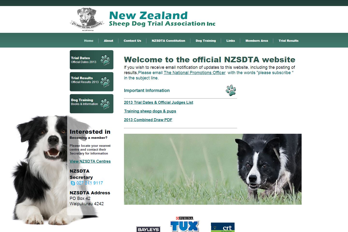
An existing client of ours, the NZSDTA wanted their site to look fresh and updated.
We also took a look at the structure of the site and made it so things that were used more freqently were found easily.
Having a white background with a feature colour of green really makes the site stand out.
View the live site here
|
|
 |
Quilt & Bag Boutique
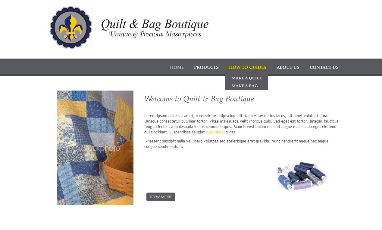
This site has a modern elegance to it. It has a nice, clean and spacious layout which is also reflected in the product layout.
The products were loaded into the site via excel spread sheet and it uses our eDIY basic shopping cart.
View the live site here
|
|
 |
Corporate Gift Ideas
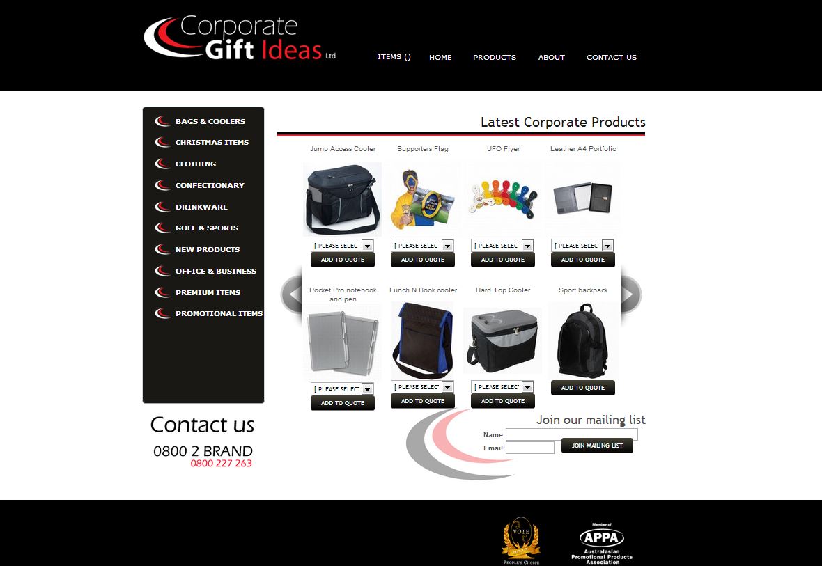
The client wanted a custom cart where people could add items to a quote and when the quote is finished it emailed them. With our new adaptable shopping cart this was simple. The latest products in the center of the page is selectable from the list of products the client has set up
in eDIY.
View the live site here
|
|
 |
DJS Cabinetry
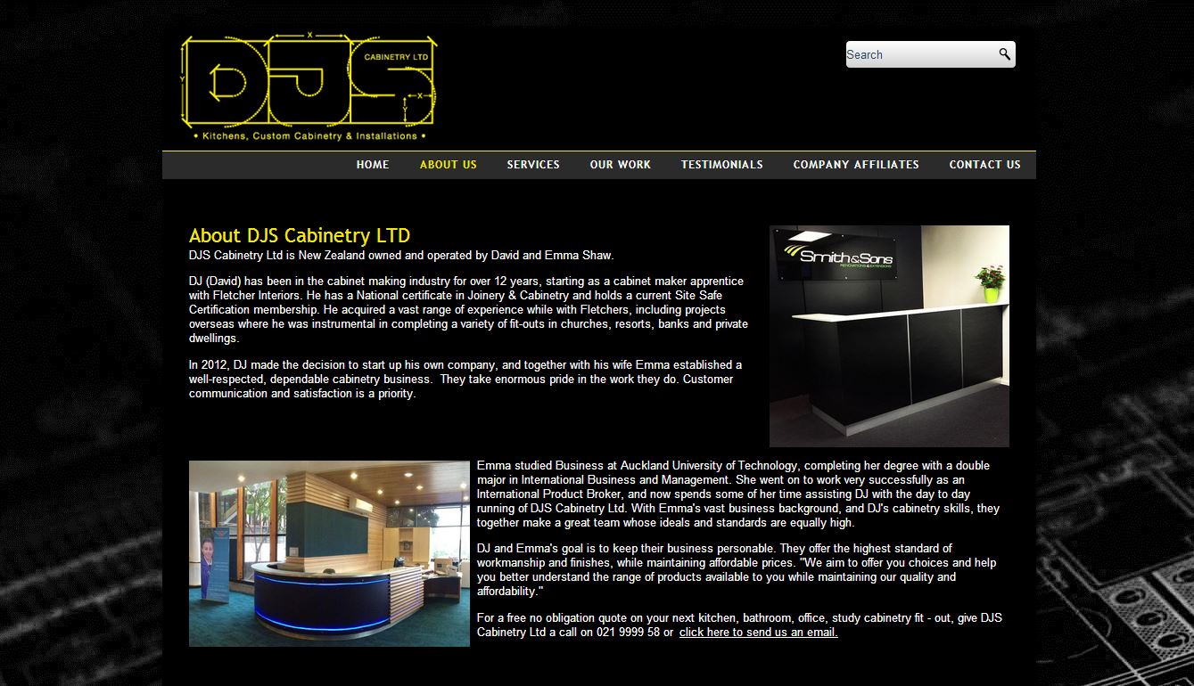
Modern, a bit technical, and a site that really stands out. DJS Cabinetry knew what they were looking for in the way of a design, and from that we came up with this design. A real feature is the large slideshow on the homepage which is a great way to show off their great
work.
View the live site here
|
|
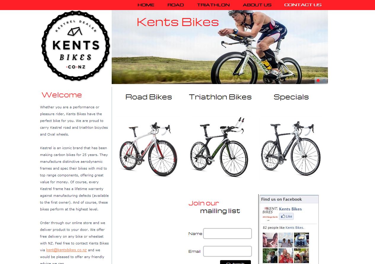 |
Kents Bikes
This was a quick re-design of an existing eDIY site. Kents Bike's new logo needed to be added to the site so we took the opportunity to re-design the site style, layout and product layout at the same time.
Some cool features of this site are: The group description which is in the right column beside each product group.
The sound which was something that the client wanted. Header slideshow adds a dynamic feel to the site, Custom fonts and a facebook plugin for status updates.
View the live site here
|
|
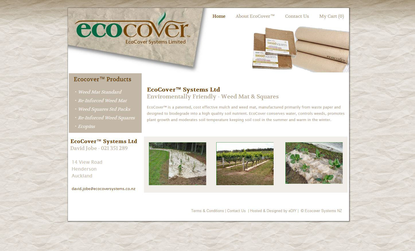 |
EcoCover New Zealand
Existing eDIY client had sold the business to new client a good chance re-design the site. We wanted the products to feature in the home page straight away so people visiting the site can see exactly what EcoCover is. Add in a nice reycled paper background and you have an
earthy, natural yet modern design.
View the live site here
|
|
|
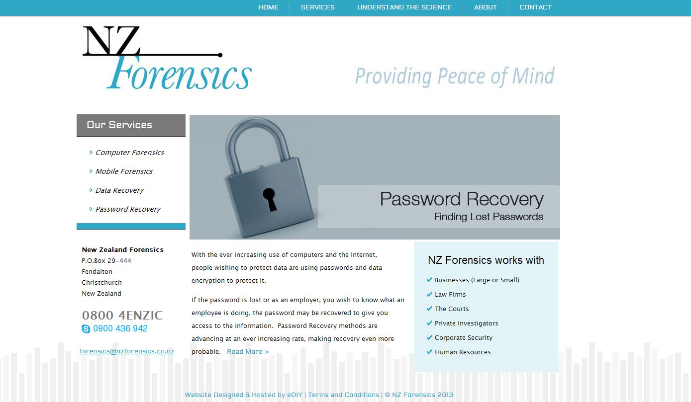
New Zealand Forensics
Another existing client looking for a fresh new design to boost his business, The old site was a bit wordy and didnt really show that NZ Forensics was about "computer and technology forensics" the images were dotted around the site and didnt really relate to the text. The
new site uses clever coding to show descriptions for each slideshow image one by one, this reduces the overwhelming amount of text that used to be there. Using the blue and grey and adding a graphic to the background of the site makes it more like its a technology realated site.
View the live site here
|
|
|
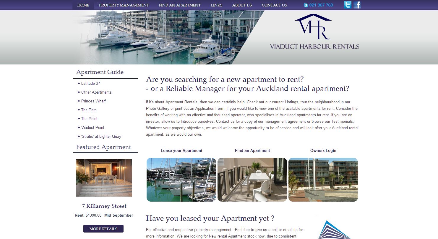
Viaduct Harbor Rentals
When I first looked at the existing eDIY Viaduct Harbour Rentals site, I thought the client rented boats. When I found out it was apartment accomodation I new something had to be done to make it clearer on the home page that this was his target audience.
The new site uses eDIY's product groups and layouts to add information quickly for each apartment. Each apartment detail layout has a slideshow of images a description and if the apartment is avaliable for rent a price and details are shown.
View the live site here
|
|
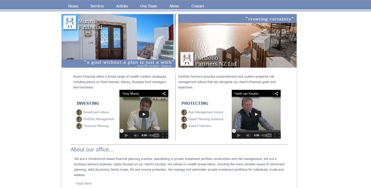 |
Munro Financial
The clients were looking for something very specific when it came to re-designing the Munro Financial site. There are two sections to the site, Munro Financial, and Portfolio partners and they wanted to make sure it was clear to see which part of the site you are on , to do this we
created nice big headers with the corresponding logo for each page.
View the live site here
|
|